Happy Publication Day!
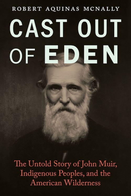
As CAST OUT OF EDEN rolls off the press today, keep in mind that commonplace saying, “You can’t tell a book by its cover.” Like a lot of things we’ve been told, that’s just plain wrong.
Truth is, you can tell a great many things about a book by its cover. Like the torn clothes and burgeoning flesh of a bodice-ripping romance novel, the ranks of an army plunging into battle on a new translation of Leo Tolstoi’s War and Peace, or the suffused deep greens of Rachel Carson’s lyric The Sea Around Us. Somehow, in a way below the strictly verbal, you grasp an essential element of what the book is about — and whether it’s something you want to take the time to read.
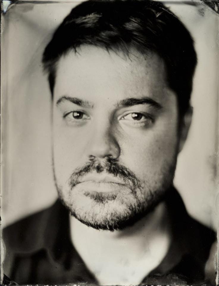
That’s why I wanted to talk with Nathan Putens, the lead senior designer-compositor at the University of Nebraska Press who designed Cast out of Eden’s cover and page layout. Unlike many publishers, who farm out their cover and page design to freelancers as something they don’t want to be bothered with in-house, UNP maintains a staff of four designers who work together collaboratively, sometimes adding freelancers to the mix for fresh perspectives. Covers receive careful attention at UNP, and with 140–150 titles a year books coming out under the press’s various imprints, the workload is both important and considerable.
Nathan told me:
“Covers began as a way of protecting the book. That’s why they used to be called dust jackets. But now the cover does much more.”
Importantly, it lives on bookstore shelves for months after publication and potentially for years on the internet:
“So I think of the cover as a movie poster, a simple, beautiful graphic that stands out against other books in the same category and demands to be noticed.”
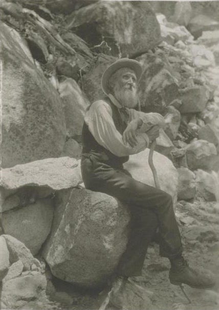
When it came to designing the cover for Cast out of Eden, I was clear about what I didn’t want. On the design form sent to UNP with the final manuscript, I wrote, “Please NO images of Muir looking wistfully into the Sierra distance. Something of a cliché.”
With that limited guidance in mind, Nathan set to work. Dozens upon dozens of Muir images are available in various archives, and he searched through them. Nathan narrowed the field of non-wistful Muirs to six then settled on one that had something artistically different about it.
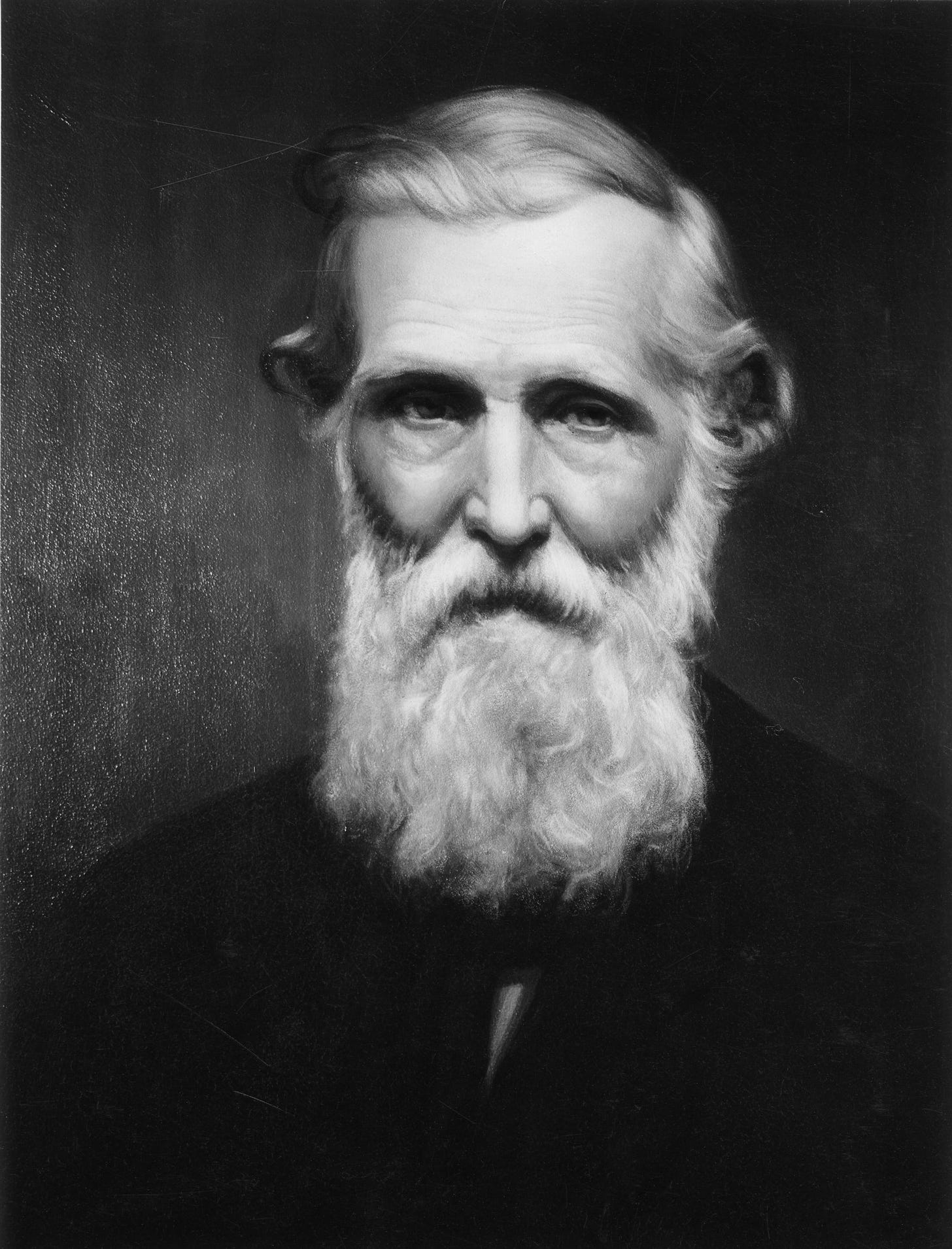
It began as a photograph. Portraitist William Edward Dassonville took the photo of Muir sometime between 1900, when he opened a studio in San Francisco with fellow photographer Oscar Maurer, and 1906, when the San Francisco earthquake destroyed their workspace. Fortunately most of Dassonville’s work survived. Then, in the late 1930s, painter Herbert Collins, who was working for the National Park Service’s Western Museum Laboratories in Berkeley, did a take-off portrait from Dassonville’s photo, one of several Muir images he created for NPS.
Nathan said :
“I was drawn to this image right away, in part because it was a portrait taken from a photo, which rendered and refined Collins’s sense of Muir.”
Indeed, what struck me when I first saw Collins’s portrait in Nathan’s preliminary design is the atypical severity of Muir’s face and its setting against a surrounding darkness. The mystic who dubbed the Sierra Nevada the Range of Light, comes across as brooding, severe, and judgmental. In my mind this image re-creates Muir as Old Testament prophet, a fearsome and fierce Jeremiah casting a condemning gaze on the world’s wickedness.
And that fits Muir’s story more than most people realize. His father was a religious fanatic who enlisted Calvinism’s punishing deity to justify the abuse he visited on his children, particularly young John. As an adult Muir flipped the image of the Divine from a violent parent into a cosmic source of unbounded love and light. However, Calvinism’s condemnation of the world and its ways remained with Muir throughout his life. That reality comes through in the Dassonville-Collins image.
Then there was the matter of the type elements on the cover. For the title, Nathan chose Franklin Gothic, a classically American sans-serif font that adds a stark punch to headlines. And he emphasized “Eden” by putting it in boldface, essentially boosting that scripturally charged word to the power of two.
The other type elements on the cover, my byline and The Untold Story of John Muir, Indigenous Peoples, and the American Wilderness subtitle, were set in Caslon to differentiate them from the title. And Nathan added color to the subtitle to help it stand out against the darkness under Muir’s portrait.
The overall effect is stunning, and for such brilliant work I thank Nathan and UNP. The cover gives me a rush even today, several months after I first saw it.
So, what do you think? Please tell me, and Nathan, in a comment.
Upcoming Cast out of Eden Events
• Friday, June 7, 10 a.m.–noon, Berkeley OLLI: Under the auspices of the Osher Lifelong Learning Institute at the University of California, I'll be giving an expanded talk and Q&A about Cast out of Eden and John Muir's legacy of wildlands dispossession and exclusion. Online only, livestreamed and recorded. More information, including my short video about the class, and registration are available here.
• Sunday, June 23, 2 p.m., Livermore Public Library: I'll be talking about Cast out of Eden and signing copies at this in-person event at 1188 South Livermore Ave., Livermore, CA.
For appearances later this summer, check the Events page on my website. And if you’re interested in hosting an event, please use my website’s Contact page.




Thanks for the explanation of the cover, Bob. My wife was a book designer (HBJ, in NYC) about 40 years ago, so I have learned to appreciate both covers and the insides. I had wondered about it when I saw it, and your, and Nathan's, take on Muir and the perspective you had hoped for were in every way successful. Good job, Nathan (and team)!
I’ve ordered my copy and can’t wait to read. The cover is amazing. The title Cast out of Eden so brilliantly beckons a reading and the portrait is mesmerizing. See you in August at the Olli Cal State lecture! Congratulations on its publication!